Why Power Apps Component Libraries Matter
Build Once. Reuse Everywhere:
In Power Apps development, speed matters. But consistency, governance, and long-term maintainability matter even more.
Many organizations start building Canvas Apps quickly, but over time they face the same problem: every app has its own buttons, headers, menus, colors, navigation patterns, popups, and layouts. At first, that may not seem like a big issue. But once an organization has 10, 20, 50, or even 100 apps, inconsistency becomes expensive.
That is where Power Apps Component Libraries become powerful.
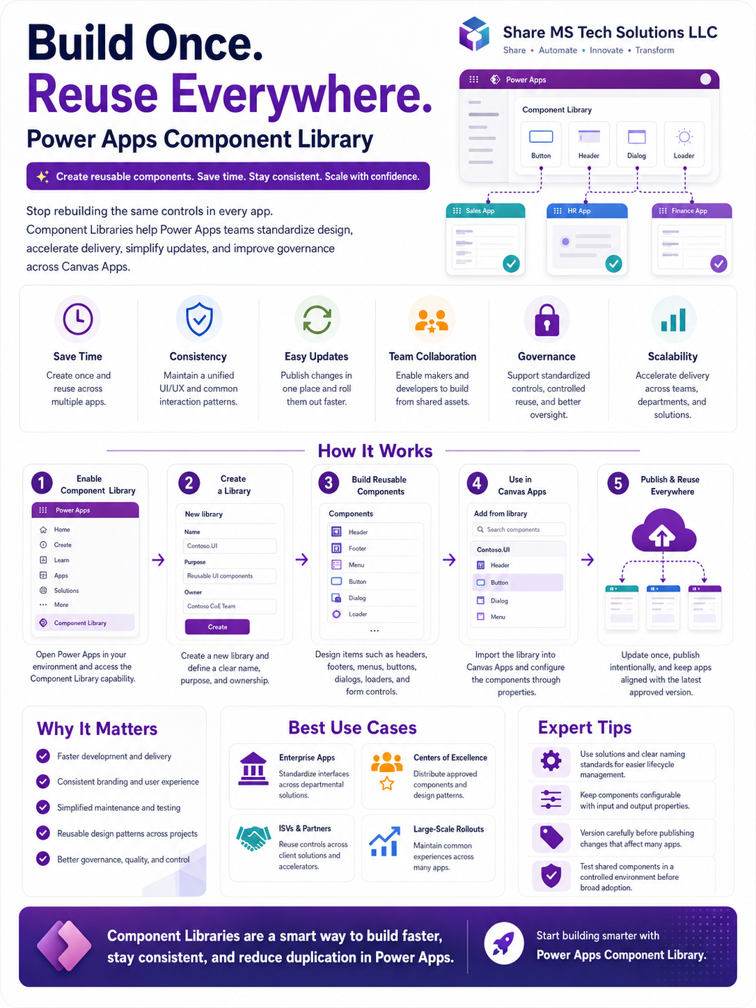
A Component Library allows makers and developers to create reusable components once and use them across multiple Canvas Apps. Instead of rebuilding the same controls again and again, teams can standardize their user interface, improve delivery speed, and manage design updates from one central place.
What Is a Power Apps Component Library?
A Power Apps Component Library is a centralized place where reusable UI components are created, stored, managed, and shared across Canvas Apps.
These components can include:
- Headers
- Footers
- Navigation menus
- Buttons
- Dialog boxes
- Loaders
- Notification banners
- Form sections
- Reusable input controls
- Branding elements
Instead of copying and pasting controls from one app to another, developers can build approved components inside a library and import them into different apps.
The idea is simple:
Build once. Reuse everywhere.
Why Component Libraries Are Important
Power Apps is easy to start with, but enterprise-scale Power Apps development requires structure. Without a shared design system, every maker may build apps differently. This leads to inconsistent user experiences, more maintenance work, and weaker governance.
Component Libraries help solve that problem by giving teams a reusable foundation.
1. Save Development Time
One of the biggest benefits of Component Libraries is time savings.
Think about how often developers recreate the same elements:
- A company header
- A left-side navigation menu
- A submit button
- A loading spinner
- A confirmation popup
- A standard footer
- A role-based menu
If every app team rebuilds those from scratch, the organization wastes hours across every project. With Component Libraries, a developer builds the component once and reuses it across multiple apps.
This is especially valuable for organizations with many departmental apps, such as HR apps, finance apps, sales apps, onboarding apps, asset management apps, and approval apps.
2. Improve Consistency Across Apps
Users should not feel like every internal business app belongs to a different company.
When apps have different button styles, colors, spacing, navigation menus, and form layouts, the experience becomes confusing. Component Libraries help create a consistent UI/UX across Power Apps.
For example, your organization can define one standard:
- Header style
- Navigation design
- Button design
- Error message format
- Success message format
- Form section layout
- Color palette
- Icon style
This makes your apps look more professional and easier to use.
Consistency is not just about design. It also improves user confidence. When users recognize the same layout and behavior across apps, they learn faster and make fewer mistakes.
3. Simplify Updates and Maintenance
Without Component Libraries, updating a shared design element across many apps can become painful.
For example, imagine your organization changes its branding color or wants to update the navigation design. If 30 apps each have their own version of that navigation, someone must manually update every app.
That creates risk:
- Some apps may be missed
- Some updates may be applied incorrectly
- Testing becomes harder
- The user experience becomes inconsistent
With Component Libraries, updates can be made in one central place, published intentionally, and then reused by the apps that depend on the component.
This does not mean changes should be pushed carelessly. Component updates must still be versioned, tested, and deployed properly. But the maintenance model becomes much cleaner.
4. Support Team Collaboration
Power Apps development is no longer only a one-person activity. In many organizations, multiple makers, developers, business analysts, and Centers of Excellence work together.
Component Libraries allow teams to share approved assets instead of duplicating work.
A Center of Excellence can create a library of reusable components and make them available to makers across the organization. Developers can create advanced components, while citizen developers can use those components safely inside business apps.
This creates a better balance between speed and control.
5. Strengthen Governance
Governance is one of the most overlooked benefits of Component Libraries.
In enterprise Power Platform environments, leaders need to answer important questions:
- Are apps following approved design standards?
- Are makers using reusable assets?
- Are components tested before being reused?
- Are critical UI patterns controlled?
- Are teams duplicating the same work?
- Are apps maintainable long term?
Component Libraries help support better governance by encouraging standardization, controlled reuse, and better ownership.
A well-managed component library should have:
- Clear naming standards
- Defined ownership
- Version control discipline
- Documentation
- Testing process
- Environment strategy
- Solution-based deployment
- Approval before broad reuse
The real value is not just creating components. The real value is managing them like enterprise assets.
How Power Apps Component Libraries Work
The process usually follows five main steps.
Step 1: Enable and Access Component Library
Start inside your Power Apps environment and access the Component Library capability.
Before creating components, confirm the environment strategy. In larger organizations, you may not want every maker creating their own unmanaged library everywhere. A better approach is to define where official components live and who owns them.
Step 2: Create a Component Library
Create a new Component Library with a clear name and purpose.
For example:
Company.UI.CoreHR.App.ComponentsFinance.Shared.ControlsCoE.StandardComponents
Avoid vague names like Test Library, My Components, or New Library. Naming matters because these assets may be reused across many apps and teams.
A strong library should clearly define:
- Who owns it
- What it is used for
- Which apps can use it
- How updates are approved
- How changes are tested
Step 3: Build Reusable Components
Next, create components inside the library.
Good candidates include:
- Header component
- Footer component
- Navigation menu
- Primary button
- Secondary button
- Loading spinner
- Success message
- Error message
- Confirmation dialog
- Search box
- Filter panel
- Form section wrapper
The best components are configurable. That means they should use input and output properties so they can adapt to different apps.
For example, a header component may accept:
- App title
- User name
- Environment name
- Logo visibility
- Theme color
- Help link
- Back button visibility
This makes the component reusable instead of hardcoded.
Step 4: Use Components in Canvas Apps
After the library is created and components are ready, app makers can import the library into Canvas Apps.
Once imported, makers can use the shared components just like other controls. They can configure properties and connect the component to the app logic.
This is where Component Libraries become very useful. Instead of building from scratch, makers start with approved reusable assets.
Step 5: Publish and Reuse Everywhere
When the component library is updated, changes can be published and reused across apps.
However, this must be handled carefully.
A mistake in a shared component can affect many apps. That is why organizations should test components before broad rollout.
Recommended practice:
- Build in a development environment
- Test with sample apps
- Validate component behavior
- Use managed solutions where appropriate
- Document version changes
- Communicate updates to app owners
- Avoid breaking changes without notice
Component libraries are powerful, but they require discipline.
Best Use Cases for Component Libraries
Component libraries are useful in many scenarios, but they are especially valuable for enterprise teams.
Enterprise Apps
Organizations with many internal apps can use component libraries to standardize the user experience across departments.
For example:
- HR onboarding app
- IT request app
- Finance approval app
- Asset management app
- Procurement app
- Employee self-service app
All of these apps can share the same navigation, branding, buttons, messages, and layout patterns.
Centers of Excellence
A Power Platform Center of Excellence can use component libraries to distribute approved components to makers.
This helps the CoE move from simply monitoring apps to actively enabling better app development.
Instead of telling makers what not to do, the CoE provides reusable tools that help makers build better apps faster.
ISVs and Consulting Partners
Component Libraries are also useful for partners who build Power Apps solutions for multiple clients.
A consulting team can create reusable patterns for the following:
- Navigation
- Forms
- Dashboards
- Admin screens
- Error handling
- Notifications
- Branding
This improves delivery speed and creates a more repeatable solution framework.
Large-Scale App Rollouts
When an organization is rolling out many apps across teams or locations, consistency becomes critical.
Component libraries help maintain a common experience across large-scale deployments. This is especially useful when multiple makers are contributing to the same app ecosystem.
Expert Best Practices
To get the most value from Power Apps Component Libraries, do not treat them as random reusable controls. Treat them as part of your enterprise app architecture.
Here are some best practices.
Use Clear Naming Standards
Use names that describe the purpose and scope of the component.
For example:
cmpHeaderMaincmpNavigationSidecmpDialogConfirmcmpButtonPrimarycmpLoaderOverlaycmpMessageBanner
Avoid unclear names like:
Component1ButtonNewHeaderFinalTestComponent
Good naming makes maintenance easier.
Keep Components Configurable
Avoid hardcoding values inside components.
Use custom properties to make components flexible. A reusable button component should allow changes to text, color, icon, visibility, disabled state, and action behavior.
A component that cannot be configured will eventually be copied and modified manually, which defeats the purpose of reuse.
Use Input and Output Properties
Input properties allow the app to pass data into the component.
Output properties allow the component to send information back to the app.
This is one of the most important skills when building reusable components in Power Apps. Without properties, components become limited. With properties, components become flexible and scalable.
Test Before Publishing
A shared component can affect multiple apps. That means testing is not optional.
Before publishing updates, test the component in a controlled app. Check different screen sizes, user roles, data conditions, and edge cases.
For example, test:
- What happens if a value is blank?
- What happens on mobile size?
- What happens with long text?
- What happens when the user does not have permission?
- What happens if the component is used in multiple screens?
Avoid Breaking Changes
If a component is already used by many apps, be careful when changing property names, removing behavior, or redesigning major logic.
A small update in the library can cause problems across multiple apps if not handled properly.
When possible, introduce new properties instead of removing old ones immediately. Communicate changes to app owners before publishing major updates.
Use Solutions for Lifecycle Management
For enterprise projects, components should not live randomly in unmanaged places without ownership.
Use solutions to organize, move, and manage components across environments. This supports better application lifecycle management, especially when moving from development to test to production.
Document Your Components
Every shared component should have basic documentation.
Include:
- Component name
- Purpose
- Owner
- Input properties
- Output properties
- Example usage
- Known limitations
- Version notes
Documentation helps makers use the components correctly and reduces support questions.
The Unspoken Truth
Many Power Apps teams do not have a technology problem. They have a reuse problem.
They keep building new apps, but they do not build a reusable system. That creates duplicated work, inconsistent design, and long-term maintenance headaches.
Component Libraries are not just a nice feature. They are one of the signs that a Power Apps team is maturing.
A beginner builds one app.
An experienced maker builds many apps.
A mature Power Platform team builds reusable patterns that make every future app faster, cleaner, and easier to govern.
Final Thoughts
Power Apps Component Libraries help organizations build faster, stay consistent, and reduce duplication across Canvas Apps.
They are especially valuable for enterprise apps, Centers of Excellence, consulting teams, and large-scale Power Platform rollouts.
The goal is not only to create beautiful components. The goal is to create reusable building blocks that improve delivery, governance, and long-term maintainability.
If your organization is serious about scaling Power Apps, Component Libraries should be part of your development strategy.
Build once. Reuse everywhere. That is how Power Apps teams move from isolated app building to scalable enterprise solution delivery.
Share MS Tech Solutions LLC
Share • Automate • Innovate • Transform