Power BI Case Study
Geospatial Analysis and Regional Sales Performance
1. Case Study Scenario
Industry
This case study is based on a fictional e-commerce retail company called Northwind Digital Retailers.
The company sells consumer products online across multiple regions, including the United States, Canada, the United Kingdom, Germany, Australia, and selected international markets.
The company has a fictional dataset of 10,000 sales transaction rows containing order details, customer locations, product categories, revenue, profit, and geographic coordinates.
Business Problem
The executive team wants to understand which regions generate the highest sales, which areas are underperforming, and where marketing spend should be increased or reduced.
Currently, the company reviews sales performance using traditional tables and monthly summaries. However, leadership cannot easily answer important geographic questions such as:
Which states or regions generate the highest revenue?
Which cities have strong sales but low profit margins?
Where are we getting high order volume but low average order value?
Which product categories perform best by location?
Which regions should receive more marketing budget?
Where should we reduce spend because performance is weak?
The goal of this Power BI case study is to create an interactive geospatial dashboard that helps stakeholders identify top-performing regions, sales clusters, and regional opportunities.
Business Objectives
The Power BI solution should help the business:
Identify top-performing countries, states, cities, and sales territories
Compare revenue, profit, order volume, and average order value by region
Detect underperforming locations with low sales or low margin
Analyze product category performance across different regions
Support smarter marketing budget allocation
Help regional managers monitor sales performance visually
Provide executives with an interactive map-based dashboard
2. Data Schema Requirements
The fictional dataset contains 10,000 rows, where each row represents one customer order or order line.
Main Sales Table: SalesTransactions
Recommended columns:
| Column Name | Data Type | Description |
|---|---|---|
| OrderID | Text | Unique order identifier |
| OrderDate | Date | Date when order was placed |
| ShipDate | Date | Date when order was shipped |
| CustomerID | Text | Unique customer identifier |
| CustomerName | Text | Customer full name or company name |
| Segment | Text | Consumer, Corporate, Small Business, Enterprise |
| Country | Text | Customer country |
| StateProvince | Text | State, province, or region |
| City | Text | Customer city |
| PostalCode | Text | ZIP or postal code |
| Latitude | Decimal Number | Geographic latitude |
| Longitude | Decimal Number | Geographic longitude |
| Region | Text | Sales region such as Northeast, South, Midwest, West |
| SalesTerritory | Text | Internal sales territory |
| ProductID | Text | Unique product identifier |
| ProductName | Text | Product name |
| ProductCategory | Text | Furniture, Technology, Office Supplies, Apparel, Electronics |
| ProductSubcategory | Text | More detailed product grouping |
| Quantity | Whole Number | Number of units sold |
| UnitPrice | Decimal Number | Price per unit |
| Discount | Decimal Number | Discount percentage or amount |
| Revenue | Decimal Number | Total sales amount |
| Cost | Decimal Number | Total cost |
| Profit | Decimal Number | Revenue minus cost |
| ShippingCost | Decimal Number | Cost of shipping |
| OrderPriority | Text | Low, Medium, High, Critical |
| SalesChannel | Text | Website, Mobile App, Marketplace, Partner |
| MarketingCampaign | Text | Campaign name or code |
| ReturnFlag | True/False | Indicates whether order was returned |
| CustomerRating | Decimal Number | Customer satisfaction score |
| DeliveryDays | Whole Number | Days between order date and ship date |
Optional Dimension Tables
For a cleaner Power BI model, create dimension tables.
Date Table
| Column Name | Description |
|---|---|
| Date | Calendar date |
| Year | Year |
| Quarter | Quarter |
| Month Number | Month number |
| Month Name | Month name |
| Week Number | Week number |
| Day Name | Day of week |
Product Table
| Column Name | Description |
|---|---|
| ProductID | Product key |
| ProductName | Product name |
| ProductCategory | Main product category |
| ProductSubcategory | Product subcategory |
Geography Table
| Column Name | Description |
|---|---|
| GeographyID | Unique geography key |
| Country | Country |
| StateProvince | State or province |
| City | City |
| PostalCode | ZIP or postal code |
| Latitude | Latitude |
| Longitude | Longitude |
| Region | Sales region |
| SalesTerritory | Sales territory |
Customer Table
| Column Name | Description |
|---|---|
| CustomerID | Customer key |
| CustomerName | Customer name |
| Segment | Customer segment |
| City | City |
| StateProvince | State or province |
| Country | Country |
3. Step-by-Step Power BI Implementation
A. Data Loading and ETL in Power Query
Step 1: Load the Dataset
In Power BI Desktop:
- Open Power BI Desktop.
- Select Get Data.
- Choose the file source, such as Excel, CSV, or SQL database.
- Load the fictional 10,000-row sales dataset.
- Open Power Query Editor for data cleaning.
Step 2: Validate Data Types
In Power Query, confirm the correct data types:
OrderDate = Date
ShipDate = Date
Revenue = Decimal Number
Cost = Decimal Number
Profit = Decimal Number
Latitude = Decimal Number
Longitude = Decimal Number
Quantity = Whole Number
ReturnFlag = True/False
Incorrect data types are one of the most common reasons map visuals and DAX calculations fail.
Step 3: Clean Location Fields
Location data must be clean for accurate map visuals.
Recommended cleanup steps:
Remove extra spaces from Country, StateProvince, and City
Standardize country names such as “USA” to “United States”
Standardize state names such as “CA” to “California” if needed
Replace blank city values with “Unknown” only if the row must be retained
Remove rows where Latitude or Longitude are completely invalid
Check for swapped latitude and longitude values
Remove coordinates outside valid ranges
Valid latitude range: -90 to 90
Valid longitude range: -180 to 180
Step 4: Handle Location Data Errors
Common location data problems include missing coordinates, misspelled states, inconsistent country names, and duplicate postal codes.
Recommended handling:
If Latitude or Longitude is missing but City, State, and Country are available, keep the row but flag it as “Missing Coordinates.”
If Country is missing, mark the row as “Unknown Country” and exclude it from map-level analysis.
If Latitude is greater than 90 or less than -90, mark the row as invalid.
If Longitude is greater than 180 or less than -180, mark the row as invalid.
If City names are duplicated across countries, use Country + State + City to avoid ambiguity.
Create a custom column:
Location Quality Status
Suggested values:
Valid Location
Missing Coordinates
Invalid Coordinates
Incomplete Address
This helps stakeholders understand data quality before trusting map visuals.
Step 5: Create a Geography Key
Create a unique geography key to support modeling.
Example:
Country-StateProvince-City-PostalCode
This helps connect the SalesTransactions table to a Geography dimension table.
B. Data Modeling
Recommended Model Design
Use a star schema where the SalesTransactions table is the fact table and the supporting tables are dimensions.
Fact Table
SalesTransactions
Dimension Tables
Date
Product
Customer
Geography
Recommended Relationships
Create these relationships in Power BI:
SalesTransactions[OrderDate] → Date[Date]
SalesTransactions[ProductID] → Product[ProductID]
SalesTransactions[CustomerID] → Customer[CustomerID]
SalesTransactions[GeographyID] → Geography[GeographyID]
Set relationship direction to single direction from dimension tables to the fact table where possible.
This keeps the model cleaner, faster, and easier to maintain.
Essential DAX Measures
Create the following core measures.
Total Revenue =
SUM(SalesTransactions[Revenue])
Total Cost =
SUM(SalesTransactions[Cost])
Total Profit =
SUM(SalesTransactions[Profit])
Total Orders =
DISTINCTCOUNT(SalesTransactions[OrderID])
Total Quantity =
SUM(SalesTransactions[Quantity])
Average Order Value =
DIVIDE([Total Revenue], [Total Orders])
Profit Margin % =
DIVIDE([Total Profit], [Total Revenue])
Return Rate % =
DIVIDE(
    CALCULATE(COUNTROWS(SalesTransactions), SalesTransactions[ReturnFlag] = TRUE()),
    COUNTROWS(SalesTransactions)
)
Revenue per Customer =
DIVIDE(
    [Total Revenue],
    DISTINCTCOUNT(SalesTransactions[CustomerID])
)
Marketing Efficiency =
DIVIDE([Total Profit], [Total Revenue])
Regional Ranking Measure
Use this to rank regions by revenue.
Region Revenue Rank =
RANKX(
    ALL(Geography[Region]),
    [Total Revenue],
    ,
    DESC,
    Dense
)
Top Region Flag
Use this to identify top-performing regions.
Top Region Flag =
IF([Region Revenue Rank] <= 5, "Top Region", "Other Region")
Revenue Contribution %
Use this to show how much each region contributes to total revenue.
Revenue Contribution % =
DIVIDE(
    [Total Revenue],
    CALCULATE([Total Revenue], ALL(Geography[Region]))
)
C. Visualization Setup
Recommended Dashboard Page Name
Regional Sales Performance Dashboard
Page Layout
Use a clean executive dashboard layout:
Top row: KPI cards
Middle section: Large interactive map
Right side: filters and regional ranking
Bottom row: trend and category analysis
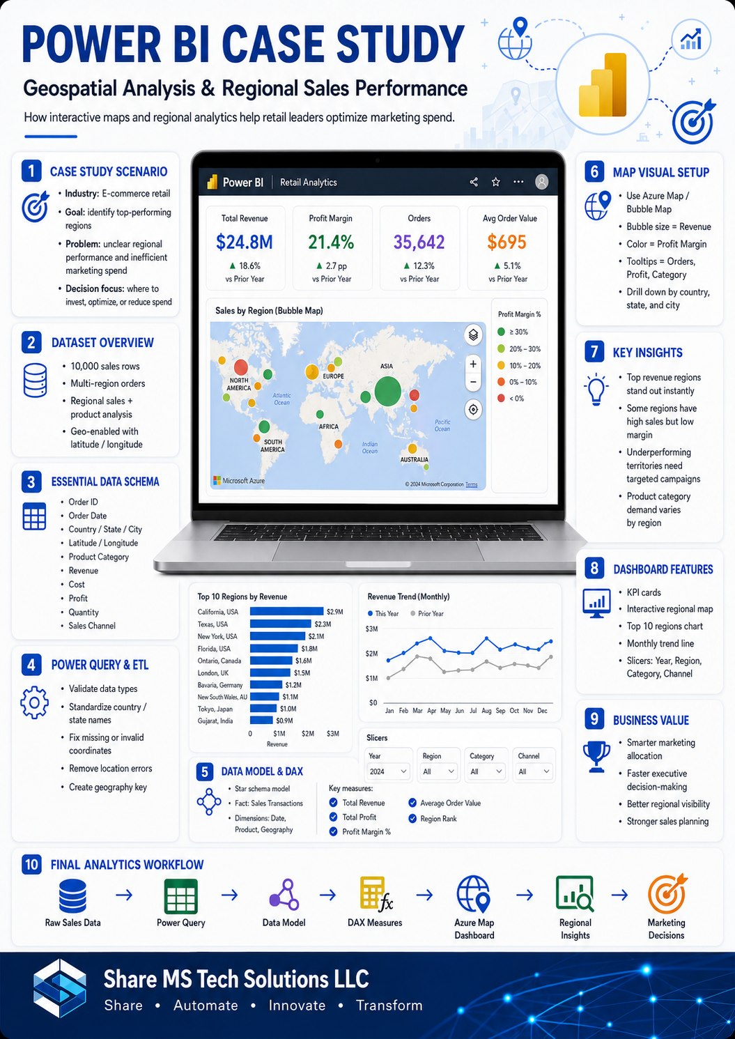
KPI Cards
Add these cards at the top of the dashboard:
Total Revenue
Total Profit
Profit Margin %
Total Orders
Average Order Value
Return Rate %
These KPIs give stakeholders an immediate business summary before they analyze the map.
Map Visual Option 1: Azure Map
Azure Map is a strong choice for advanced geospatial analysis.
Steps to Build Azure Map
- Insert the Azure Maps visual.
- Add Latitude to the Latitude field.
- Add Longitude to the Longitude field.
- Add City or StateProvince to Location.
- Add Total Revenue to Size.
- Add Profit Margin % to Color or Legend.
- Add ProductCategory to Tooltip.
- Add Total Orders, Total Profit, and Average Order Value to Tooltips.
- Use bubble size to represent revenue.
- Use color saturation to show profitability.
Recommended Interpretation
Large bubbles show high-revenue areas.
Darker or stronger color represents higher profit margin.
Large bubble with weak margin means high sales but possible cost or discounting issue.
Small bubble with high margin may indicate an opportunity for targeted marketing growth.
Map Visual Option 2: Filled Map
A Filled Map is useful when comparing performance by state, province, or country.
Steps to Build Filled Map
- Insert the Filled Map visual.
- Add Country, StateProvince, or Region to Location.
- Add Total Revenue to Color Saturation.
- Add Region to Legend if needed.
- Add Total Revenue, Total Profit, Profit Margin %, and Total Orders to Tooltips.
- Format data colors to highlight top-performing regions.
- Turn on map labels if useful.
Recommended Interpretation
Darker regions show stronger revenue performance.
Light regions show weaker performance.
Stakeholders can quickly compare regional sales coverage.
Map Visual Option 3: Bubble Map
A Bubble Map works well for city-level or store-level sales.
Steps to Build Bubble Map
- Insert the Map visual.
- Add Latitude and Longitude.
- Add City to Location.
- Add Total Revenue to Bubble Size.
- Add ProductCategory or Region to Legend.
- Add Profit Margin %, Total Orders, and Average Order Value to Tooltips.
- Use filters for Year, Quarter, Product Category, and Sales Channel.
Recommended Interpretation
This helps identify sales clusters, city-level hotspots, and regional growth patterns.
Supporting Visuals
Add these visuals around the map.
Bar Chart: Top 10 Regions by Revenue
Axis: Region or StateProvince
Values: Total Revenue
Tooltip: Profit Margin %, Total Orders, Average Order Value
Matrix: Regional Performance Table
Rows: Country, StateProvince, City
Values: Total Revenue, Total Profit, Profit Margin %, Total Orders, Average Order Value
Line Chart: Revenue Trend by Month
X-Axis: Date[Month Name]
Y-Axis: Total Revenue
Legend: Region
Donut Chart: Revenue by Product Category
Legend: ProductCategory
Values: Total Revenue
Slicer Panel
Add slicers for:
Year
Quarter
Country
Region
StateProvince
ProductCategory
SalesChannel
Customer Segment
4. Key Insights and Dashboard Features
The final dashboard should help stakeholders identify where the company is winning, where it is struggling, and where marketing dollars should go next.
Insight 1: Top Revenue Regions
The map should clearly show the regions generating the highest revenue.
Example fictional insight:
The West and Northeast regions generate the highest revenue, driven by strong Technology and Electronics sales in major metropolitan areas.
Business action:
Increase marketing investment in high-performing regions to maximize growth.
Insight 2: High Sales but Low Profit
Some regions may generate strong revenue but weak profit margin.
Example fictional insight:
California and New York show high order volume, but profit margin is lower because of heavy discounts and high shipping costs.
Business action:
Review discount strategy, shipping costs, and product mix in high-revenue but low-margin regions.
Insight 3: Underperforming Regions
The map may reveal regions with low sales activity.
Example fictional insight:
Several Midwest cities show low revenue and low order volume despite having active customer accounts.
Business action:
Launch targeted campaigns, local promotions, or sales outreach in underperforming markets.
Insight 4: Product Category by Region
Different regions may prefer different product categories.
Example fictional insight:
Technology products perform best in urban regions, while Office Supplies perform better in corporate-heavy territories.
Business action:
Customize marketing campaigns by region and product category.
Insight 5: Return Rate by Location
Some regions may have higher return rates.
Example fictional insight:
Certain cities show strong revenue but also higher-than-average return rates.
Business action:
Investigate product quality, delivery issues, customer expectations, or inaccurate product descriptions.
Insight 6: Marketing Spend Optimization
The dashboard can help determine where to increase, reduce, or redesign marketing spend.
Recommended decision framework:
Increase spend in high-revenue, high-margin regions
Optimize pricing in high-revenue, low-margin regions
Test campaigns in low-revenue, high-margin regions
Reduce spend in low-revenue, low-margin regions
Recommended Dashboard Features
The final Power BI dashboard should include:
Interactive Azure Map or Bubble Map
Region, state, and city drill-down
Revenue and profit margin tooltips
Top 10 region ranking
Product category filter
Sales channel filter
Customer segment filter
Monthly trend analysis
Regional performance matrix
Return rate visibility
Marketing opportunity indicators
Stakeholder Value
For Executives
The dashboard shows which regions are driving revenue and profit.
For Marketing Teams
The dashboard shows where marketing spend should be increased, adjusted, or reduced.
For Sales Managers
The dashboard shows regional sales trends and territory-level performance.
For Operations Teams
The dashboard highlights shipping cost, delivery, and return patterns by geography.
For Data Analysts
The dashboard creates a reusable analytical model for geospatial decision-making.
Final Business Outcome
By using Power BI geospatial analysis, the company can move from static sales reports to interactive location-based decision-making.
Instead of asking, “How much did we sell last month?” stakeholders can ask better questions:
Where are we growing fastest?
Which regions are most profitable?
Which cities need more attention?
Where is marketing spend producing the best return?
Where are hidden opportunities?
This case study shows how Power BI can turn 10,000 rows of sales data into a clear regional performance story.
A well-designed geospatial dashboard does not just show locations on a map. It helps the business decide where to invest next.
Share MS Tech Solutions LLC
Share • Automate • Innovate • Transform
🔧 Recommended Tools for Power BI
- Laptop for Power BI & Power Apps
- 27” Monitor for Dashboard Design
- Webcam for Teams Meetings
- External SSD for Dataset Storage
- Power BI Beginner Course
These are the tools I recommend for analytics and Power Platform development.